|
|
|
|
|
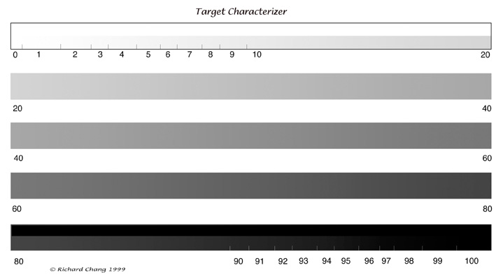
The Target Characterizer file is designed to identify the highest and lowest separating values your target will render. Printing or displaying the Target Characterizer file will identify the highest valued image reflectance that separates from white, and will identify the lowest separable image reflectance that will separate from maximum black.
The Target Characterizer file when displayed, will allow you to see if the monitor agrees with the known separable high and low values supported by your output device. After profiling, monitor energy is typically high in the low values which can sometimes mislead the novice user who depends on the display. Monitor profiles attempt to linearize the monitor, which can present problems of correct display for specific targets that are not linear, such as high dot gain printing presses and low density range targets like the inkjet water color surfaces popular today. Verify by displaying the Target Characterizer File, that the monitor's display of transition to black and to white, matches the printed Characterizer File. Some profiling applications allow the making of visual profiles, which may be more beneficial than the instrumented profile in some workflows. Matching the monitor's display of endpoints with the printed rendering of endpoints can be of considerable value. Be aware that the value of a monitor calibration can be multi-faceted, displays can adjusted for image contrast and for color accuracy. While some proponents of instrumented monitor calibrations will suggest the user can visually see the monitor's soft proof with extreme accuracy for color and contrast, I will not recommend the editing of the color content of image files, based on a monitor's display. I question the transmissive RGB phosphor attempting to display the color of many targets like a high dot gain press, especially when the press target will run an off-white paper stock. I find it impossible to ignore my understanding of the laws of physics; transmissives are different than reflectives and RGB phosphors don't identically match reflective dyes, pigments, inks, or sublimations. A monitor profile can, when used with a properly adjusted visual implementation, show the user what kind of shape will typically render on the target, if the monitor basically matches the printed Target Characterizer file when rendered to that target. Bear in mind, the careful worker will always verify that the numbers describing important image densities are relevant to the emotional rendering intended. We know that some densities our camera files contain cannot be rendered on the target, specifically because of an inabilitiy to separate adjacent tones at the ends of the scale. These are typically very bright and very dark densities on prints, and very bright and very dark opacities on monitor displays and transparencies. The target's darkest and lightest endpoints are often more challenging for rendering separation, for two different reasons. On the shadow end, the difficulty lies in the reflectance of the low value. Low values don't reflect a lot of light energy, which is why we want to make bigger jumps in contrast with our photography technique and our "digital emulsion" (tone curve). With bigger jumps in contrast our eyes can see more easily, the shape of dark, three dimensional objects on the two dimensional, reflective print target. These big contrast jumps are necessary, without them, our eyes will often see a singular tone, even when the file contains several ascending or descending tones. Shadows on monitors and transmissive targets behave differently than those on reflective substrates, shadows separate better on transmissive targets as compared to reflective targets. At the highlight end of the scale we have a different problem with rendering separation, at least on printing presses imaged with frequency modulated screens. If a given area of 2% for example, can only contain a dot in 2% of the available screen area, then 98% cannot contain a dot and cannot be used to render separable detail in high valued reflectances. This means only 2% of the available area can be used to render detail, typically not enough dot area to describe much in the way of high valued reflectances, especially if they are highly detailed high reflectances. This mechanical printing paradox makes the monitor more important to evaluate because the typical monitor profile's ability to generate separable transitions to the very brightest white point, does not match how the highlights will behave on the high gain press. The challenge for high gain presses is that they don't hold 2%, they more often hold 7% to 12%, making the monitor even more difficult to trust. For printing presses, dot gain adds problems into the visual discerning of separation at the ends of the scale. Because a wet ink dot bleeds, or soaks, to a larger dot size when it is applied to paper, we attempt to predict the amount of increase and appropriately constrict its size so that when we properly predict the increase in size, we end up with the dot size we want. This phenomenon can be seen on newspaper by placing a drop of liquid on the surface of the paper. The wet spot will become much larger as the paper absorbs the liquid. On press, measuring the paper's dot size in comparison to the dot value as read by the computer's densitometer probe will allow prediction of accurate dot gain. Of course the phenomenon of dot gain becomes more apparant and more problematic as the reflectance on the paper target gets darker, hence the need for the Characterizer Target. Print the Target Characterizer file on the target you intend to make images for. Look to see what the Characterizer file holds as separable from white in the highlights and what separates from black in the shadows. Make sure the appropriate adjustments for dot gain are included in the CMYK transform. These indicated endpoints are the aimpoints for your lighting and exposure. Use easily discerned visualizations when choosing aimpoints. Do not study at length, the lowest separable reflectance for example, your audience might not give your work the same careful examination. It is probably better to choose an easily discerned low value, such low valued placements can easily be adjusted downward without penalty if they err on the conservative side. If you are a MegaVision shooter, check the Color Coded Light Metering to make sure they agree with your Characterizer file's rendering. Adjust and save any adjustments to the Setup>Range Colors dialog box so that your light metering will be custom tailored for your target. A good practice target is the Epson inkjet printer, print the Characterizer file to an Epson printer, make a custom Color Coded Light Metering in Setup>Range Colors, and shoot some test images for the Epson printer. Experiment with different paper brightnesses. Mastering the Epson target will allow the careful worker to craft emotive transition of tone for any target.
|