
|
|
|
|
|
The demonstration image was captured in the MegaVision T2 version 3.2 Capture Station software. It did not need Photoshop adjustment because 3.2 allows complete transitioning of the scale of the capture. I was able to make the placements I wanted with lighting, aperture, exposure, and the T2 software. An aid to the capture of this 1.8 density range (average for coated web paper) image is 3.2's Color Coded Light Metering, used here to accurately set the endpoints (see 3.2 Range Colors image); highlight at zone IX.6 (4%) and shadow at zone .6 (94%). 3.2's Meter function displays as colors (5 colors are available for now) any 5 zones or range of zones as a specific color. One can choose any 7 important values you'd like to place; you'll adjust lighting or 3.2 software (or both) so that your important values display the range color you've chosen. If you've identified the proper density range of your target, verified that placements match known appropriate densities, checked for adequate contrast across important transitions, made sure that the endpoints (max highlight and shadow) fit the target, and verified complete neutrality from highlight to shadow, you are essentially finished. Crafting black and white is the same, just skip the neturality check. If the capture software does not allow complete transitioning or if you're adjusting a scan, you'll probably need to make a stop in Photoshop to finish up. Photoshop allows anchoring sections of the curve by clicking anchors along the transition line. You'll need at least three anchors to prevent the moving of a section. If, for instance (Image #3), you find a zone IV1/2 reflectance is really reading zone V, move it by clicking on the transition line where it crosses the fifth line from the bottom and drag it one half line down; toward zone IV. Verify the move by noting the Show Info "before" and "after" reads 50%/55%. Also note that the contrast has increased from zone III 3/4 up to the anchor at zone VI 1/2 . The contrast has decreased in two areas, from zone 10 down to zone VI 1/2 and from the shadow up to zone III 3/4 . As the curve transitions more vertically, the contrast is increased. The more horizontally transitioning curve will flatten the contrast. Increasing the contrast along the curve in one area usually producess a lower contrast somewhere else along the curve. A good, general plan is to increase the contrast where the reflectances are lowest, spreading the tones; making them easier to see, while flattening the curve nearest the highlight where we'd like to pack tones closer together. We might want to read a transitioning shadow as 100%-96%-92%-90%-88%-86% (big jumps in separation); this would be an easily discernable low value transition by any viewer. At the same time we might want to see a highlight transition read 0%-1%-2%-3%-4%-5%, indicating a very smooth transition down from the highlight. We do not usually respond favorably to a transition where the first available density darker than zero is 10%.
The zone system is also very good when communicating your ideas to others. If, for instance, you said you placed the most important low value on zone II, made sure mid-tone adjacencies had at least half zone jumps, and the highest important value was a zone IX 1/2; I would have a pretty good understanding of your visual intent. And if the resulting repro did not mimic the placement of values, we'd have a solid platform from which to problem solve why the repro failed to mimic the original file. Why should you trouble yourself with the Zone System or the digital process? The digital process allows the movement of reflectances and control of contrast that is unavailable with the exposure and development controls of silver based imaging. The silver halide worker might make the observation that digital is taking the craftsmanship out of photography. The digital process is not taking the craftsmanship out of photography, it is making improvements in our ability to generate high quality images. It is certainly easier and more cost effective to preview changes to the image file after the digital capture than make changes with film based images. Increasing the contrast in low values while decreasing the contrast in the highlights is simply not possible with film (plus developments increase the contrast in the highs more than the lows because lows have very little or no development potential). It's easy with curves; you can have a N+1 curves move in a zone II value and have an N-1 in the high values in the scene. Try the concepts presented here. I think you'll find your understanding of the digital workflow rewarding, especially if you can relate capture placements with output reflectances. Complete craftsmanship of an image to its intended target will allow the printing of that image without the disappointments common to the translation of your well conceived target image to another target. What if you don't get exactly the value you predict? Very much like a light meter that reads a half stop off, as long as you know the relationship to "correct" it's not too hard to make appropriate adjustments as long as the process is consistent. Good luck! If you have any questions about this topic, e-mail your queries to rchang@transitionoftone.com. I'll get back to you as soon as time allows.
|
|
|

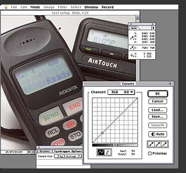 Convert
Photo-shop's grid from a quarter-tone grid to a 10% (ten zone) grid by
option+clicking within the grid above the transition bar (a second option+click
will return the grid to the default quarter-tone display). Read the placement
of important values in your scene by positioning any Photoshop cursor
on the reflectance you're interested in. View the grayscale display in
the Show Info dialog box. Make sure the value you want appears in the
Show Info dialog box. If it does not, move it to the appropriate spot
by clicking on the transition line (here it's 79%/zone II) and drag it
to the value you're interested in. If it's not within one-half zone of
your intended zone you might need a new capture. That's the photography
part.
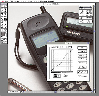
Convert
Photo-shop's grid from a quarter-tone grid to a 10% (ten zone) grid by
option+clicking within the grid above the transition bar (a second option+click
will return the grid to the default quarter-tone display). Read the placement
of important values in your scene by positioning any Photoshop cursor
on the reflectance you're interested in. View the grayscale display in
the Show Info dialog box. Make sure the value you want appears in the
Show Info dialog box. If it does not, move it to the appropriate spot
by clicking on the transition line (here it's 79%/zone II) and drag it
to the value you're interested in. If it's not within one-half zone of
your intended zone you might need a new capture. That's the photography
part.
 The
zone system is particularly good when adjusting an image for a creative
result. Moving reflectances in 10% jumps helps in rapidly choosing the
desired result. Seeing the print after checking the values in the file
will reinforce the understanding of how bright each zonal reflectance
appears on the print media. Trial and error will go a long way when testing
if the move is tracked by noting the zonal value and its relationship
to the final result.
The
zone system is particularly good when adjusting an image for a creative
result. Moving reflectances in 10% jumps helps in rapidly choosing the
desired result. Seeing the print after checking the values in the file
will reinforce the understanding of how bright each zonal reflectance
appears on the print media. Trial and error will go a long way when testing
if the move is tracked by noting the zonal value and its relationship
to the final result.